There are three common grid-based widgets in Slate:
- SGridPanel
- SUniformGridPanel
- SUniformWrapPanel
SGridPanel
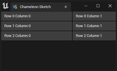
SGridPanel is used to create an m-column n-row grid layout. You can specify the width ratio of each column.
For example, the code below "FillColumn": [[0, 0.62], [1, 0.38]] sets the width of column 0 and column 1 to 0.62:0.38.
    "SGridPanel":
    {
        "FillColumn": [[0, 0.62], [1, 0.38]],
        "Slots":
        [
            {
                "Column_Row": [0, 0],
                "SButton": { "Text": "Row 0 Column 0", "ContentPadding": [0, 8]}
            },
            {
                "Column_Row": [1, 0],
                "SButton": { "Text": "Row 0 Column 1", "ContentPadding": [0, 8]}
            },
            {
                "Column_Row": [0, 1],
                "SButton": { "Text": "Row 1 Column 0", "ContentPadding": [0, 8]}
            },
            {
                "Column_Row": [1, 1],
                "SButton": { "Text": "Row 1 Column 1", "ContentPadding": [0, 8]}
            },
            {
                "Column_Row": [0, 2],
                "SButton": { "Text": "Row 2 Column 0", "ContentPadding": [0, 8]}
            },
            {
                "Column_Row": [1, 2],
                "SButton": { "Text": "Row 2 Column 1", "ContentPadding": [0, 8]}
            }
        ]
    }
SUniformGridPanel
SUniformGridPanel is used to create an m-column n-row grid layout that evenly divides the space.
    "SUniformGridPanel": {
        "MinDesiredSlotHeight": 150,
        "MinDesiredSlotWidth": 150,
        "SlotPadding": 5,
        "Slots": [
            {
                "Column_Row": [0, 0],
                "SButton": { "Text": "Placeholder A"}
            },
            {
                "Column_Row": [1, 0],
                "SButton": { "Text": "Placeholder B"}
            },
            {
                "Column_Row": [2, 0],
                "SButton": { "Text": "Placeholder C"}
            },
            {
                "Column_Row": [0, 1],
                "SButton": { "Text": "Placeholder D"}
            },
            {
                "Column_Row": [1, 1],
                "SButton": { "Text": "Placeholder E"}
            },
            {
                "Column_Row": [2, 1],
                "SButton": { "Text": "Placeholder F"}
            }
        ]
    }
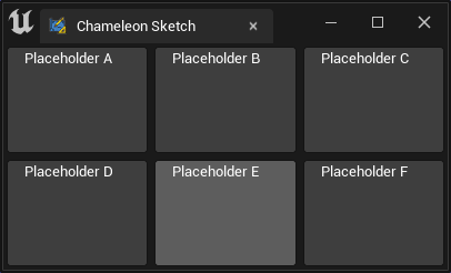
You can use "MinDesiredSlotWidth" and "MinDesiredSlotHeight" to specify the minimum size of a single grid.
NOTE
There is no "MaxDesiredSlotWidth" or "MaxDesiredSlotHeight" in "SUniformGridPanel". If you need to control the maximum size, you can add an SBox to its parent and set the corresponding "MaxDesiredWidth" or "WidthOverride", etc.
    "SUniformGridPanel": {
        "MinDesiredSlotWidth": 100,
        "MinDesiredSlotHeight": 100,
        ...
    }
Applications
Maps
Button Padding
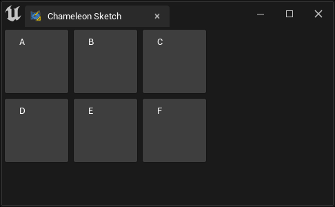
In UE5, Epic added 8 px of whitespace on the horizontal direction of SButton. Advantages:
The button ratio looks more appropriate Disadvantages:
When the button is small in size, the left and right whitespace can obstruct the text display
Solution
In SButton, use negative value to set the padding of the left and right sides to -8 px.
    "SButton": {
        "Text": "Placeholder A",
        "ContentPadding": [-8, 0]
    }
SUniformWrapPanel
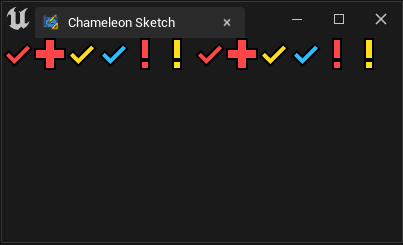
Similar to SUniformGridPanel, "SUniformWrapPanel" can also create grid layouts. Unlike it, "SUniformWrapPanel" will try to place child widgets in each row from top to bottom as much as possible. If there is not enough space, they will be placed in the next row.
    "SUniformWrapPanel": {
        "Slots":
        [
            {"SImage": { "DesiredSizeOverride": [32, 32], "Image":{ "Style": "FEditorStyle", "Brush": "Perforce.CheckedOut"}}}
            ,{"SImage": { "DesiredSizeOverride": [32, 32], "Image":{ "Style": "FEditorStyle", "Brush": "Perforce.OpenForAdd"}}}
            ,{"SImage": { "DesiredSizeOverride": [32, 32], "Image":{ "Style": "FEditorStyle", "Brush": "Perforce.CheckedOutByOtherUser"}}}
            ,{"SImage": { "DesiredSizeOverride": [32, 32], "Image":{ "Style": "FEditorStyle", "Brush": "Perforce.CheckedOutByOtherUserOtherBranch"}}}
            ,{"SImage": { "DesiredSizeOverride": [32, 32], "Image":{ "Style": "FEditorStyle", "Brush": "Perforce.ModifiedOtherBranch"}}}
            ,{"SImage": { "DesiredSizeOverride": [32, 32], "Image":{ "Style": "FEditorStyle", "Brush": "Perforce.NotAtHeadRevision"}}}
            ,{"SImage": { "DesiredSizeOverride": [32, 32], "Image":{ "Style": "FEditorStyle", "Brush": "Perforce.CheckedOut"}}}
            ,{"SImage": { "DesiredSizeOverride": [32, 32], "Image":{ "Style": "FEditorStyle", "Brush": "Perforce.OpenForAdd"}}}
            ,{"SImage": { "DesiredSizeOverride": [32, 32], "Image":{ "Style": "FEditorStyle", "Brush": "Perforce.CheckedOutByOtherUser"}}}
            ,{"SImage": { "DesiredSizeOverride": [32, 32], "Image":{ "Style": "FEditorStyle", "Brush": "Perforce.CheckedOutByOtherUserOtherBranch"}}}
            ,{"SImage": { "DesiredSizeOverride": [32, 32], "Image":{ "Style": "FEditorStyle", "Brush": "Perforce.ModifiedOtherBranch"}}}
            ,{"SImage": { "DesiredSizeOverride": [32, 32], "Image":{ "Style": "FEditorStyle", "Brush": "Perforce.NotAtHeadRevision"}}}
        ],
        "ToolTipText": "UniformWrapPanel will auto wrap the children."
    }
For example, in this case, SUniformWrapPanel will try to place the 32 x 32 SImage in a row as much as possible.
NOTE
In UE4, the SImage component does not have a "DesiredSizeOverride" property. To control the size of SImage, you need to use SBox.
{
    "SBox": { "MinDesiredHeight": 32, "MinDesiredWidth": 32,
    "Content": {
        "SImage": { "Image":{ "Style": "FEditorStyle", "Brush": "Tutorials.Navigation.NextButton"}}}
    }
}