Vertical Layout SVerticalBox, Horizontal Layout SHorizontalBox
SVerticalBox and SHorizontalBox are the two most commonly used widget layouts.
They enable child widgets and layouts to be arranged sequentially, and can be found in almost every tool.
For example, the following image uses nested SVerticalBox and SHorizontalBox. For a specific video, see here.
This article will clarify the layout and alignment logic of SVerticalBox and SHorizontalBox, involving keywords:
- Slots
- AutoWidth, AutoHeight
- HAlign, VAlign
Rules
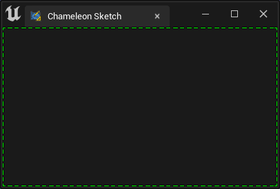
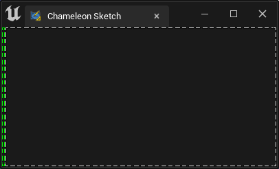
Rule 1. By default, each child widget will occupy as much available space as possible
In the following image, when there is only one widget (SBorder), it will fill the entire window
"Root":{
    "SBorder": {
        "BorderImage": { "Style": "FEditorStyle", "Brush": "DashedBorder"},
        "BorderBackgroundColor": [0, 1, 0, 1]
    }
}
Occupying all the space:
When replaced with SButton, a large button filling the entire window is created:
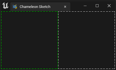
Rule 2. Child widgets in the same layout will equally share all available space
"Root":{
    "SHorizontalBox":
    {
        "Slots": [
            {
                "SBorder": { "BorderBackgroundColor": [0, 1, 0, 1], "BorderImage": { "Style": "FEditorStyle", "Brush": "DashedBorder"}}
            },
            {
                "SBorder": { "BorderBackgroundColor": [1, 1, 1, 1], "BorderImage": { "Style": "FEditorStyle", "Brush": "DashedBorder"}}
            }
        ]
    }
}
Both sides are equally divided:
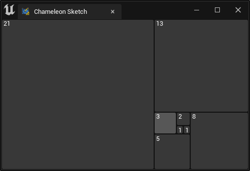
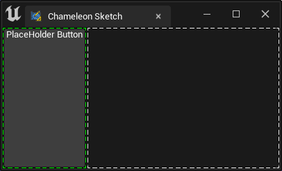
Rule 3. When AutoWidth or AutoHeight is set for a Slot, Rule 2 is invalidated, and the child widget will only occupy the space it needs
In the following image, the left green box has no other widgets inside, so the size it needs is just the 4 pixels occupied by its own border
"Root":{
    "SHorizontalBox":
    {
        "Slots": [
            {
                "AutoWidth": true,
                "SBorder": { "BorderBackgroundColor": [0, 1, 0, 1], "BorderImage": { "Style": "FEditorStyle", "Brush": "DashedBorder"}}
            },
            {
                "SBorder": { "BorderBackgroundColor": [1, 1, 1, 1], "BorderImage": { "Style": "FEditorStyle", "Brush": "DashedBorder"}}
            }
        ]
    }
}
Left side has AutoWidth, but no content:
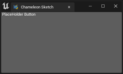
If an SButton is placed inside the first SBorder, the size needed by the SBorder is only the size needed by the SButton
"Root":{
    "SHorizontalBox":
    {
        "Slots": [
            {
                "AutoWidth": true,
                "SBorder": { "BorderBackgroundColor": [0, 1, 0, 1], "BorderImage": { "Style": "FEditorStyle", "Brush": "DashedBorder"},
                    "Content": {
                        "SButton": { "Text": "PlaceHolder Button" }
                    }
                }
            },
            {
                "SBorder": { "BorderBackgroundColor": [1, 1, 1, 1], "BorderImage": { "Style": "FEditorStyle", "Brush": "DashedBorder"}}
            }
        ]
    }
}
The left side has AutoWidth, and an SButton is placed inside:
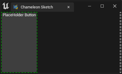
Rule 4. 4. When setting HAlign or VAlign, AutoWidth or AutoHeight cannot be used simultaneously
In the following image, the right white box is set to align to the right. At this point, AutoWidth cannot be used. The widget will align to the right and only occupy the space it needs
"Root":
{
    "SHorizontalBox":
    {
        "Slots": [
            {
                "AutoWidth": true,
                "SBorder": { "BorderBackgroundColor": [0, 1, 0, 1], "BorderImage": { "Style": "FEditorStyle", "Brush": "DashedBorder"},
                    "Content": {
                        "SButton": { "Text": "PlaceHolder Button" }
                    }
                }
            },
            {
                "HAlign": "Right",
                "SBorder": { "BorderBackgroundColor": [1, 1, 1, 1], "BorderImage": { "Style": "FEditorStyle", "Brush": "DashedBorder"}}
            }
        ]
    }
}
Left side has AutoWidth with an SButton inside
Note
AutoWidthis an attribute of SHorizontalBox Slots, whileAutoHeightis an attribute of SVerticalBox Slots. They can only be specified in their respective Slots and will not appear together- Pay attention to the Output window's tips. When a property name is written incorrectly, or a non-existent property is used, there will be a warning message
The "MinDesiredWidth" and "MinDesiredHeight" in SBox need a parent component with layout functionality like SVerticalBox or SHorizontalBox to work
Practical Use
In practical use, you usually place multiple SHorizontalBox, SScrollBox within an SVerticalBox, and inside each child layout widget, there are other SVerticalBox, SHorizontalBox and so on.
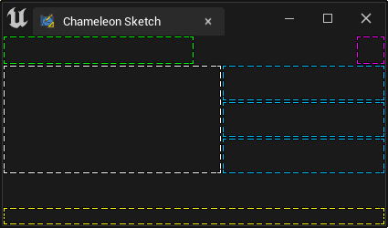
For example, the interface below uses SBorder to simulate a simple interface layout:
- The green box can be a title
- The purple box is an option button, always aligned to the right
- The yellow area below is for status bars, etc.
Note
- Here, several "SBorders" are used to simulate the space occupied by subspaces. In actual use, there is usually only one "Border" in a tool interface
- Here,
"Padding": 16is used to make the "SBorder" widget occupy an extra 16 pixels on all sides, simulating the space occupied by child widgets - In reality,
"Padding"is used to control the spacing between widgets, for a more detailed explanation see here: Padding and Margin
{
    "TabLabel": "Chameleon Sketch",
    "InitTabSize": [400, 240],
    "InitTabPosition": [120, -500],
    "InitPyCmd": "import ChameleonSketch; sketch = ChameleonSketch.ChameleonSketch.ChameleonSketch(%JsonPath)",
    "Root":{
        "SVerticalBox":
        {
            "Slots": [
                {
                    "AutoHeight": true,
                    "SHorizontalBox":
                    {
                        "Slots": [
                            {
                                "SBorder": {
                                    "BorderBackgroundColor": [0, 1, 0, 1], "BorderImage": { "Style": "FEditorStyle", "Brush": "DashedBorder"},
                                    "Padding": 16
                                }
                            },
                            {
                                "HAlign": "Right",
                                "SBorder": {
                                    "BorderBackgroundColor": [1, 0, 1, 1], "BorderImage": { "Style": "FEditorStyle", "Brush": "DashedBorder"},
                                    "Padding": 16
                                }
                            }
                        ]
                    }
                },
                {
                    "AutoHeight": true,
                    "SHorizontalBox":
                    {
                        "Slots": [
                            {
                                "AutoWidth": true,
                                "SBorder": {
                                    "BorderBackgroundColor": [1, 1, 1, 1], "BorderImage": { "Style": "FEditorStyle", "Brush": "DashedBorder"},
                                    "Padding": [120, 60]
                                }
                            },
                            {
                                "SVerticalBox":
                                {
                                    "Slots": [
                                        {
                                            "SBorder": { "BorderBackgroundColor": [0, 0.5, 1, 1], "BorderImage": { "Style": "FEditorStyle", "Brush": "DashedBorder"}}
                                        },
                                        {

                                            "SBorder": { "BorderBackgroundColor": [0, 0.5, 1, 1], "BorderImage": { "Style": "FEditorStyle", "Brush": "DashedBorder"}}
                                        },
                                        {
                                            "SBorder": { "BorderBackgroundColor": [0, 0.5, 1, 1], "BorderImage": { "Style": "FEditorStyle", "Brush": "DashedBorder"}}
                                        }
                                    ]
                                }
                            }
                        ]
                    }
                },
                {
                    "VAlign": "Bottom",
                    "SBorder": {
                        "BorderBackgroundColor": [1, 1, 0, 1], "BorderImage": { "Style": "FEditorStyle", "Brush": "DashedBorder"},
                        "Padding": 10
                    }
                }
            ]
        }
    }
}