Summary: This section introduces Box Layout in Slate, which is the simplest layout and deals with controlling and constraining the size of a single child widget within its Content. SBox has various properties such as MinDesiredWidth, MinDesiredHeight, MaxDesiredWidth, MaxDesiredHeight, HeightOverride, WidthOverride, HAlign, VAlign, and Padding. These properties are used to control the size, alignment, and padding of the child widget.
The previous document's Layout introduction dealt with the layout relationships between multiple widgets. If you want to precisely control the size of a widget, you need to use SBox.
In fact, the SBox layout is the simplest layout in Slate, as it only widgets and constrains the size of the single child widget within its Content.
MinDesiredWidth, MinDesiredHeight
Use MinDesiredWidth and MinDesiredHeight to limit the minimum size of child widgets. If the size required by the child widget exceeds the minimum value, the Slot will still expand as needed.
    "SBox":
    {
        "MinDesiredWidth": 200,
        "MinDesiredHeight": 80,
        "Content": {
            "SBorder": {
                "BorderBackgroundColor": [0, 1, 0, 1],
                "BorderImage": { "Style": "FEditorStyle", "Brush": "DashedBorder"}
            }
        }
    }
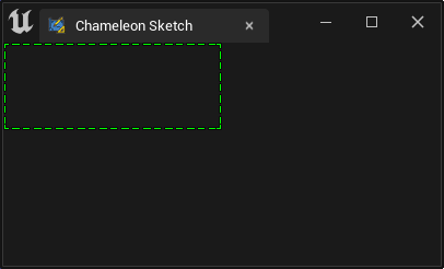
As shown in the figure below, the SBorder without a child widget still occupies a 200x80 space when no child widget is set.
MaxDesiredWidth, MaxDesiredHeight
Similarly, if you want to keep the widget size within a suitable size, you can use "MaxDesiredWidth" and "MaxDesiredHeight".
    "SBox":
    {
        "MinDesiredWidth": 200,
        "MinDesiredHeight": 80,
        "MaxDesiredWidth": 300,
        "MaxDesiredHeight": 80,
        "Content": {
            "SBorder": {
                "BorderBackgroundColor": [0, 1, 0, 1],
                "BorderImage": { "Style": "FEditorStyle", "Brush": "DashedBorder"},
                "Content": {
                    "SEditableTextBox":
                    {
                        "Text": "Some text"
                    }
                }
            }
        }
    }
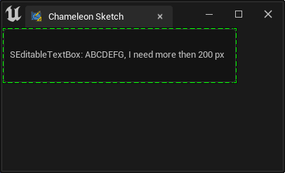
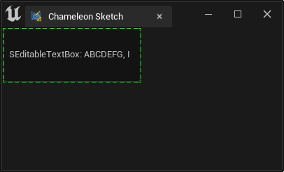
For example, in the above case, the text box will occupy a minimum of 200px, gradually widen as the content grows, and finally be limited to 300px.
HeightOverride, WidthOverride
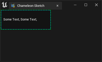
If you want the space to maintain a specific size, you can set both WidthOverride and HeightOverride. A more appropriate approach is to use "HeightOverride" and "HeightOverride".
    "WidthOverride": 200,
    "HeightOverride": 80,
Applications
For example, in UE4's SImage widget, there is no "DesiredSizeOverride" property. When we want to control the size of the SImage widget, we can set the desired display size of the image in the SBox widget and then place the actual SImage widget within the SBox widget.
HAlign/VAlign
SBox also has "HAlign" and "VAlign" to modify the content within Content.
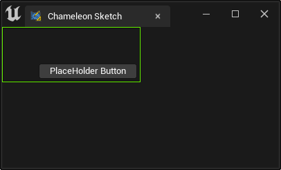
    "SBox":
    {
        "WidthOverride": 200,
        "HeightOverride": 80,
        "VAlign": "Bottom",
        "HAlign": "Right",
        "Padding": 5,
        "Content": {
            "SButton": { "Text": "PlaceHolder Button" }
        }
    }
CAUTION"HAlign" and "VAlign" are at the same level as "Content". Do not put them inside "Content".
Padding
The "Padding" property in SBox is also used to limit the content within Content.
In the example above, the gap between the button and the green frame (Slate Debug frame) comes from "Padding": 5.
For more information about Padding, see Padding and Margin.