Summary: 本节介绍了Slate中的Box布局,这是最简单的布局,处理控制和约束其Content中单个子控件的尺寸。 SBox具有各种属性,例如MinDesiredWidth,MinDesiredHeight,MaxDesiredWidth,MaxDesiredHeight,HeightOverride,WidthOverride,HAlign,VAlign和Padding。 这些属性用于控制子控件的尺寸、对齐和边距。
之前的文档中的Layout介绍,都是处理多个控件之间的布局关系.如果想要精细控制一个控件的尺寸,就需要用到SBox
实际上SBox布局是Slate各种布局中最简单的一种布局,它只控制、约束自己Content中的唯一的一个子控件的尺寸。
MinDesiredWidth, MinDesiredHeight
使用MinDesiredWidth, MinDesiredHeight用来限制子控件中的最小尺寸。如果子控件中所需要的尺寸超过了最小值,Slot则依然会按需伸缩。
    "SBox":
    {
        "MinDesiredWidth": 200,
        "MinDesiredHeight": 80,
        "Content": {
            "SBorder": {
                "BorderBackgroundColor": [0, 1, 0, 1],
                "BorderImage": { "Style": "FEditorStyle", "Brush": "DashedBorder"}
            }
        }
    }
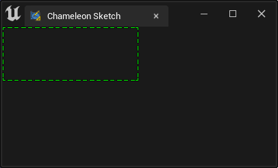
如下图,没有子控件的SBorder,在不设置子控件的情况下,依然占据了200x80的空间
MaxDesiredWidth, MaxDesiredHeight
同理,如果想要将控件的尺寸限制在一个合适的尺寸之内,就可以用"MaxDesiredWidth" 和 "MaxDesiredHeight"
    "SBox":
    {
        "MinDesiredWidth": 200,
        "MinDesiredHeight": 80,
        "MaxDesiredWidth": 300,
        "MaxDesiredHeight": 80,
        "Content": {
            "SBorder": {
                "BorderBackgroundColor": [0, 1, 0, 1],
                "BorderImage": { "Style": "FEditorStyle", "Brush": "DashedBorder"},
                "Content": {
                    "SEditableTextBox":
                    {
                        "Text": "Some text"
                    }
                }
            }
        }
    }
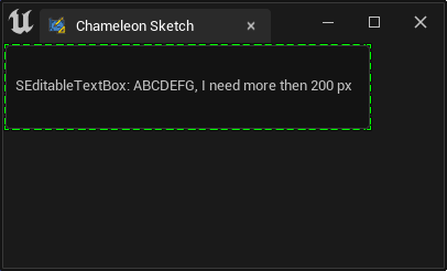
例如上面的例子中,文本框将最小占用200px,随着其中内容的最多,逐渐变宽,最终被限制在300px
HeightOverride, WidthOverride
如果想要空间已知保持一个特定尺寸,可以同时设置 WidthOverride HeightOverride, 更合适的做法是用"HeightOverride"和"HeightOverride"
    "WidthOverride": 200,
    "HeightOverride": 80,
应用
例如,在UE4的SImage控件中,由于没有"DesiredSizeOverride"属性,当我们想要控制SImage控件的尺寸的时候,就可以在SBox控件中设置好想要的图片的显示尺寸,然后在SBox的控件中放入实际使用的SImage控件。
HAlign/VAlign
SBox 中同样也有"HAlign"和"VAlign"由于修饰Content中的内容
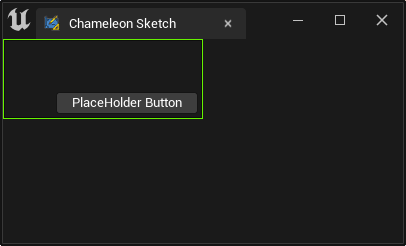
    "SBox":
    {
        "WidthOverride": 200,
        "HeightOverride": 80,
        "VAlign": "Bottom",
        "HAlign": "Right",
        "Padding": 5,
        "Content": {
            "SButton": { "Text": "PlaceHolder Button" }
        }
    }
CAUTION
"HAlign"和"VAlign" 和 "Content"是平级的. 不要写在"Content"内
Padding
SBox中的"Padding"属性,也是用来限制Content中的内容的.
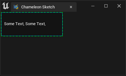
如上面的例子中,按钮和绿框(Slate Debug 框)之间的空隙,就来自"Padding": 5.
其他Padding相关内容可见Padding and Margin