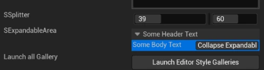
We can use SSplitter to implement adjustable user layout sizes. We can also use SetVisible to control the visibility of widgets. In addition, we can use SExpandableArea to expand complex widget interfaces, especially when there are many parameters. We can use SExpandableArea to group parameters and allow users to choose to expand or collapse them.
Parameter Explanation
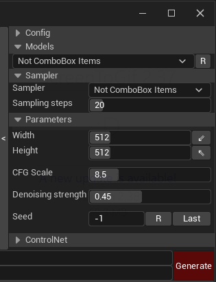
Content
Taking one of the SExpandableAreas in the image above as an example. HeaderContent and BodyContent are the title header and main content of the ExpandableArea, respectively.
TIP
Widgets like HeaderContent that can hold other child widgets are called "Container Widgets". They can not only contain STextBlock for displaying text but also SImage, SButton, and even combinations of other widgets.
Padding
HeaderPadding and Padding are used to set the margins for the title header and main content, respectively.
For details and differences about Padding, Margin, etc. see here(https://tacolor.xyz/tapython/padding_and_margin.html)
JSON
"SExpandableArea": {
    "Aka": "ModelArea",
    "BorderImage": {
        "Style": "FEditorStyle",
        "Brush": "DetailsView.CategoryTop"
    },
    "HeaderPadding": [5, 2],
    "HeaderContent": {
        "STextBlock": {
            "Text": "Models"
        }
    },
    "Padding": [5, 0, 0, 0],
    "BodyContent": {
        "SHorizontalBox":
        {
            "Slots": [
                {
                    "SComboBox": {
                        "Aka": "ModelList",
                        "Content": {
                            "Text": "ComboBox"
                        },
                        "OptionsSource": [],
                        "OnSelectionChanged": "if 'chameleon_stable_diffusion' in globals():\n\tchameleon_stable_diffusion.on_change_models(%)"
                    }
                },
                {
                    "AutoWidth": true,
                    "SButton": { "Text": "R",
                        "VAlign": "Center",
                        "ContentPadding": [-4, 0],
                        "OnClick": "chameleon_stable_diffusion.on_refresh_models_click()"
                    }
                }
            ]
        }
    }
}
InitiallyCollapsed
A boolean value that can be used to specify whether to collapse initially. The default is false.
Set it through python code:
chameleon_data_instance.set_is_expanded(aka_name: Name, expanded: bool, animated: bool = False)
TIP
In Python code, you don't need to distinguish between Name type and str type. In the method above, when we pass a str type value to aka_name, Unreal Engine will automatically do the type conversion for us.