Summary: This article introduces free layout options, Canvas and Overlay, in UE4. Canvas is useful for specifying the position and size of child widgets, while Overlay stacks child widgets in sequence, sharing the same coordinates. The article explains how to use position, alignment, size, content padding, and color in Canvas and how to apply Overlay in various situations.
Canvas
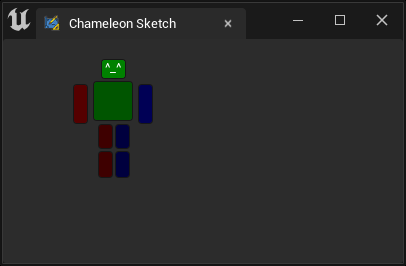
SCanvas, as its name suggests, is like a canvas where you can specify the position and size of child widgets. Canvas layout is convenient for some complex widgets that require fixed positions and sizes. For example, in the "Rigging Tool" below, the various parts of the "character" are laid out using Canvas.
    "Root":{
        "SBorder": {
            "BorderImage": {
                "Style": "FEditorStyle",
                "Brush": "ToolPanel.DarkGroupBorder"
            },
            "Content":{
                "Padding": [0, 20],
                "SCanvas": {
                    "ToolTipText": "Canvas is a layout widget that allows you to arbitrary position and size child widgets in a relative coordinate space",
                    "Slots": [
                        {
                            "Position": [97.5, 0],
                            "Size": [25, 20],
                            "SButton": {"ButtonColorAndOpacity": [0, 5, 0 ,1], "OnClick": "print('Head.')",
                                "ContentPadding": [-8, 0],
                                "Text": "^_^",
                                "ToolTipText": "Head"
                            }
                        },
                        {
                            "Position": [90, 22],
                            "Size": [40, 40],
                            "SButton": {"ButtonColorAndOpacity": [0, 2, 0 ,1], "OnClick": "print('Body.')"}
                        },
                        {
                            "Position": [70, 25],
                            "Size": [15, 40],
                            "SButton": {"ButtonColorAndOpacity": [2, 0, 0 ,1], "OnClick": "print('Right Arm.')"}
                        },
                        {
                            "Position": [135, 25],
                            "Size": [15, 40],
                            "SButton": {"ButtonColorAndOpacity": [0, 0, 2 ,1], "OnClick": "print('Left Arm.')"}
                        },
                        {
                            "Position": [95, 65],
                            "Size": [15, 25],
                            "SButton": {"ButtonColorAndOpacity": [1, 0, 0 ,1], "OnClick": "print('Right Upper Leg.')"}
                        },
                        {
                            "Position": [112, 65],
                            "Size": [15, 25],
                            "SButton": {"ButtonColorAndOpacity": [0, 0, 1 ,1], "OnClick": "print('Left Upper Leg.')"}
                        },
                        {
                            "Position": [95, 92],
                            "Size": [15, 27],
                            "SButton": {"ButtonColorAndOpacity": [1, 0, 0 ,1], "OnClick": "print('Right Leg.')"}
                        },
                        {
                            "Position": [112, 92],
                            "Size": [15, 27],
                            "SButton": {"ButtonColorAndOpacity": [0, 0, 1 ,1], "OnClick": "print('Left Leg.')"}
                        }
                    ]
                }
            }
        }
    }
Position
NOTE
The "Position" here is relative, so if you want to adjust the overall position of the buttons, you can control the position of the SCanvas itself or its parent component.
For example, the following "Padding": [0, 20] moves the SCanvas down by 20px. Of course, a more precise way is to use "Padding": [0, 0, 0, 20], so it does not affect the components below the Canvas.
    "Padding": [0, 20],
    "SCanvas": {
        ...
    }
HAlign/VAlign
By default, child widgets in the SCanvas component are aligned with "HAlign": "Left" and "VAlign": "Top" to the target coordinates.
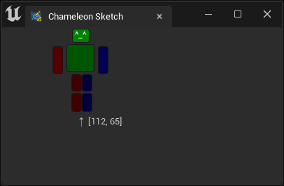
Previously, the leg part of the code set the right foot button on the left side of the character to align to the right, with Position as "Position": [112, 65],.
    {
        "Position": [95, 65],
        "Size": [15, 25],
        "SButton": {"ButtonColorAndOpacity": [1, 0, 0 ,1], "OnClick": "print('Right Upper Leg.')"}
    },
    {
        "Position": [112, 65],
        "Size": [15, 25],
        "SButton": {"ButtonColorAndOpacity": [0, 0, 1 ,1], "OnClick": "print('Left Upper Leg.')"}
    },
Changed to:
    {
        "Position": [112, 65],
        "Size": [15, 25],
        "HAlign": "Right",
        "SButton": {"ButtonColorAndOpacity": [1, 0, 0 ,1], "OnClick": "print('Right Upper Leg.')"}
    },
    {
        "Position": [112, 65],
        "Size": [15, 25],
        "SButton": {"ButtonColorAndOpacity": [0, 0, 1 ,1], "OnClick": "print('Left Upper Leg.')"}
    },
The left and right foot buttons will align to the centerline of [112, 65].
VAlign" works the same way, controlling the alignment of the widget with the target coordinates.
HAlign options:
- "Left"
- "Center"
- "Right"
VAlign options:
- "Top"
- "Center"
- "Bottom"
Size
The Size property sets the size of child widgets.
NOTE
The Canvas Slot does not have a "Padding" property, so you cannot fine-tune it with "Padding" after specifying the position.
Button's Content Padding and Color Content Padding
Some readers may have noticed that in the previous head button code, we used "ContentPadding": [-8, 0], a strange property.。
If we remove it, we'll find that the text "Text": "^_^" in the button cannot be displayed. This is because UE5 adds an extra 8px to the left and right when calculating button size, making the button too small and the text content being covered by the blank area. For a detailed explanation, see ContentPadding
Color
Similarly, in the head button, we used "SButton": {"ButtonColorAndOpacity": [0, 5, 0, 1], setting the background color of the button to a linear color of unreal.LinearColor(0,5,0,1).
NOTE
Note that the color value here is greater than 1, aiming to multiply it with the dark background of the button to get a bright green color.
Overlay
SOverlay layout places child widgets on top of each other in sequence, with later Slots covering earlier Slots. All Slots share the same coordinates.
So, if we put the SCanvas from the previous example into an SOverlay layout and add a button in parallel, we'll get a strange result:
"SOverlay":
{
    "Slots": [
        {
            "SCanvas": {
                "ToolTipText": "Canvas is a layout widget that allows you to arbitrary position and size child widgets in a relative coordinate space",
                "Slots": [...]
            }
        },
        {
            "SButton": { "Text": "A Big Opacity Button", "ButtonColorAndOpacity": [1, 0, 0, 0.3],
                "VAlign": "Center",
                "HAlign": "Center"
            }
        }
    ]
}
A semi-transparent button covers the previous "Rigging" button and handles all click events (buttons below cannot be clicked).
Application
A common use case is to create buttons with images as the background for tools, such as placing background images under the buttons for each Tile in a map editor.
Or combine multiple widgets, such as placing an SButton and an SEditableText together, so that the control has editable text and a button.
    "SOverlay": {
    "Slots": [{
            "SButton": {"ButtonStyle": {"Style": "FEditorStyle", "StyleName": "HoverHintOnly"}, "ContentPadding": [16, 0],
                "OnClick": "chameleon_shelf.on_button_click(id=0)",
                "Content": { "SImage": {"Aka": "Img_0", "ImagePathInPlugin": "Resources/PythonGreyIcon_40x.png", "ColorAndOpacity": [1,1,1,0.6]}}
            }
        },{
            "Padding": [0, 20, 0, 0],
            "SEditableText":{"Aka": "Txt_0", "Text": "", "ColorAndOpacity": [1,1,1,1], "Justification": "Right"}
        }
    ]
}
For a detailed explanation of Shelf Tools, see:Shelf Tools