In the previous article {filename}006_slate_02_layout-1_directional.md]({filename}006_slate_02_layout-1_directional.md), we used "Padding": 16 to specify the space occupied by the widget.
In this article, let's see what exactly Padding refers to, and explain the differences between several similar keywords.
Padding of Content
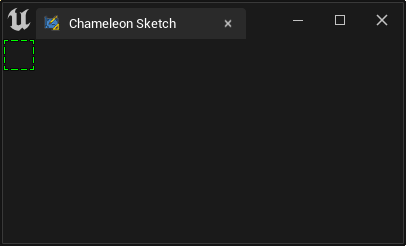
As shown in the following figure, we created an SBorder with no Content (child widget size is 0) and a Padding value of 16, so the actual size of SbBorder is 32X32 px.
    ...
    "Root":{
        "SVerticalBox":
        {
            "Slots": [
                {
                    "AutoHeight": true,
                    "SHorizontalBox":
                    {
                        "Slots": [
                            {
                                "AutoWidth": true,
                                "SBorder": {
                                    "BorderBackgroundColor": [0, 1, 0, 1], "BorderImage": { "Style": "FEditorStyle", "Brush": "DashedBorder"},
                                    "Padding": 16
                                }
                            }
                        ]
                    }
                }
            ]
        }
    }
NOTE
At this point, the Padding is inside the "SBorder", adding blank space around the inner widget (empty).
Padding of Slot
When we add "Padding" outside the SBorder, now the "Padding" modifies the first Slot in the "SHorizontalBox", so the blank space is added to the outside of the "SBorder".
    ...
    "AutoHeight": true,
    "SHorizontalBox":
    {
        "Slots": [
            {
                "AutoWidth": true,
                "Padding": 10,
                "SBorder": {
                    "BorderBackgroundColor": [0, 1, 0, 1], "BorderImage": { "Style": "FEditorStyle", "Brush": "DashedBorder"},
                    "Padding": 16
                }
            }
        ]
    }
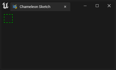
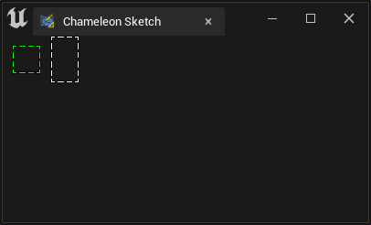
Comparing with the "SBorder" without adding Slot Padding, the green frame around the newly added 10px blank space:
    ...
    "SHorizontalBox":
    {
        "Slots": [
            {
                "AutoWidth": true,
                "Padding": 10,
                "SBorder": {
                    "BorderBackgroundColor": [0, 1, 0, 1], "BorderImage": { "Style": "FEditorStyle", "Brush": "DashedBorder"},
                    "Padding": 16
                }
            },
            {
                "AutoWidth": true,
                "SBorder": {
                    "BorderBackgroundColor": [1, 1, 1, 1], "BorderImage": { "Style": "FEditorStyle", "Brush": "DashedBorder"},
                    "Padding": 16
                }
            }
        ]
    }
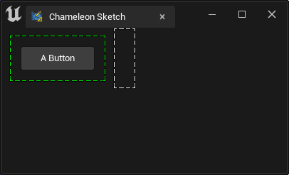
If we add a button to the Content:
    ...
    "AutoWidth": true,
    "SBorder": {
        "BorderBackgroundColor": [0, 1, 0, 1], "BorderImage": { "Style": "FEditorStyle", "Brush": "DashedBorder"},
        "Padding": 16,
        "Content":{
            "SButton": {
                "Text": "A Button"
            }
        }
    }
    ...
The "SButton" occupies the position of the previous "empty widget" in the "SBorder", with its outer edge being "Padding: 16", and the green frame's outer edge is the Slot's "Padding: 10".
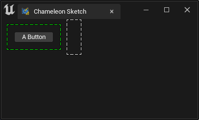
So, the size of SBorder becomes the size of the inner button plus the size of Padding.
ContentPadding of Button
If we think the button looks too cramped and want to make a "more important" button, we can adjust the button size using the "ContentPadding" in the SButton:
    ...
    "SButton": {
        "ContentPadding": [16, 8],
        "Text": "A Button"
    }
    ...
16px of blank space is added to both sides of the horizontal direction and 8px of blank space is added to both sides of the vertical direction inside the button.
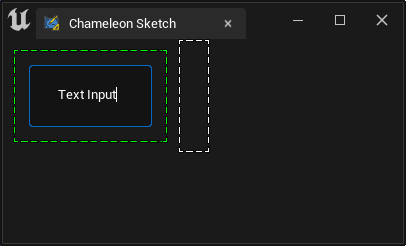
Padding of Text
Some text widgets can also set Padding values, as shown in the following "SEditableTextBox":
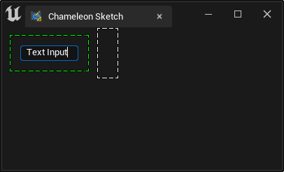
    ...
    "SBorder": {
        "BorderBackgroundColor": [0, 1, 0, 1], "BorderImage": { "Style": "FEditorStyle", "Brush": "DashedBorder"},
        "Content":{
                "SEditableTextBox": {
                    "Padding": 20,
                    "Text": "Text Input"
            }
        }
    }
After adding "Padding": 20, the text "Text Input" has 20px of blank space added around it.
Margin of Text
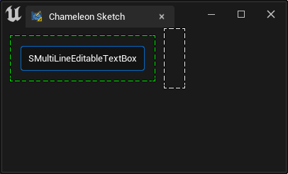
The following example is an "SMultiLineEditableTextBox", which has a "Margin" property in addition to the "Padding" property:
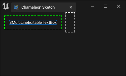
    "SBorder": {
        "BorderBackgroundColor": [0, 1, 0, 1], "BorderImage": { "Style": "FEditorStyle", "Brush": "DashedBorder"},
        "Padding": 16,
        "Content":{
                "SMultiLineEditableTextBox": {
                    "Padding": 10,
                    "Text": "SMultiLineEditableTextBox"
            }
        }
    }
After adding "Padding": 10, the same behavior as other widgets in the above text occurs, with 10px of blank space added around the text:
with "Margin": 30
    "SBorder": {
        "BorderBackgroundColor": [0, 1, 0, 1], "BorderImage": { "Style": "FEditorStyle", "Brush": "DashedBorder"},
        "Padding": 16,
        "Content":{
                "SMultiLineEditableTextBox": {
                    "Padding": 10,
                    "Margin": 30
                    "Text": "SMultiLineEditableTextBox"
            }
        }
    }
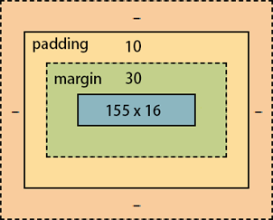
Now, the surrounding blank area becomes 10px of "Padding" + 30px of "Margin". Note the mouse display status in the animation below. When the mouse is within the inner 30px, the cursor is an "I" shape for text input. If you enable the green solid Debug box, you can see that the "Margin": 30 is on the inside of the widget, and the "Padding": 10 is on the outside.
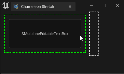
NOTE
Here, the Margin is on the inside, which is different from the outer Margin in HTML web widgets.
Padding Value Input
In JSON, when filling in Padding, Margin, and other values, we have three ways to write:
- Padding value is a number. For example, in the following example, the Padding value is 16 for all four directions (left, right, top, and bottom).
"Padding": 16,
- Padding value is an array of length 2. For example, in the following example, the horizontal Padding value is 16, and the vertical Padding value is 12.
"Padding": [16, 12],
- Padding value is an array of length 4. For example, in the following example, the Padding values for the left, top, right, and bottom (clockwise) are 10, 20, 30, and 40, respectively.
"Padding": [10, 20, 30, 40],
Summary
"SHorizontalBox","SVerticalBox"and other Layout widgets use"Padding"."ContentPadding"is specific to the SButton component.- Most text widgets have a Margin property, and text widgets with a border have a
"Padding"property. "Margin"captures the mouse inside, while"Padding"does not.
Cheat Sheet
| Slate | Description | Valid |
|---|---|---|
| Slot | Padding | ok |
| SBorder | Padding | |
| SButton | ContentPadding | ok |
| SBox | Padding | |
| SEditableText | - | No padding or margin |
| STextBlock | Margin | |
| SEditableTextBox | Padding | new |
| SMultiLineEditableText | Margin | only margin |
| SMultiLineEditableTextBox | Padding + Margin | |
| SRichTextBlock | Margin |
Padding and margin of each widget
| Padding | Margin | ||
|---|---|---|---|
| Slot | |||
| SBorder | Yes | ||
| SButton | |||
| SBox | |||
| STextBlock | No | Yes | |
| SEditableText | No | No | |
| SEditableTextBox | Yes | No | -- > : public SBorder |
| SMultiLineEditableText | No | Yes | |
| SMultiLineEditableTextBox | Yes | Yes | -- > : public SBorder |
| SRichTextBlock | No | Yes |