垂直布局 SVerticalBox, 水平布局SHorizontalBox
SVerticalBox和SHorizontalBox是使用最大的两种控件布局。
它们使得其中的子控件和子布局能够依次排列,几乎每个工具中都有它们的身影。
例如下图这个例子就使用了嵌套的SVerticalBox 和SHorizontalBox。具体视频可见这里
本文将厘清SVerticalBox和SHorizontalBox两者的布局和对齐逻辑。涉及关键字:
- Slots
- AutoWidth, AutoHeight
- HAlign, VAlign
Rules
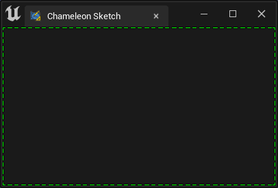
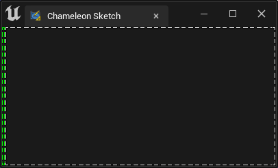
Rule 1. 默认情况下各个子控件会尽可能多得占用可用空间
如下图,当只有一个控件(SBorder)时,它将占满整个窗口
"Root":{
    "SBorder": {
        "BorderImage": { "Style": "FEditorStyle", "Brush": "DashedBorder"},
        "BorderBackgroundColor": [0, 1, 0, 1]
    }
}
独占所有空间:
换成SButton,会得到一个充满窗窗口的大按钮:
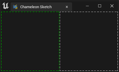
Rule 2. 同一布局下的子控件会平分所能获得的所有空间
"Root":{
    "SHorizontalBox":
    {
        "Slots": [
            {
                "SBorder": { "BorderBackgroundColor": [0, 1, 0, 1], "BorderImage": { "Style": "FEditorStyle", "Brush": "DashedBorder"}}
            },
            {
                "SBorder": { "BorderBackgroundColor": [1, 1, 1, 1], "BorderImage": { "Style": "FEditorStyle", "Brush": "DashedBorder"}}
            }
        ]
    }
}
两侧平分:
Rule 3. 当对Slot设置了AutoWidth或AutoHeight后,Rule.2失效,子控件只会占用它所需要的空间
如下图,左侧绿色框,由于它内部没有其他控件,所以它需要的尺寸只有自己边框所占用用的4个像素
"Root":{
    "SHorizontalBox":
    {
        "Slots": [
            {
                "AutoWidth": true,
                "SBorder": { "BorderBackgroundColor": [0, 1, 0, 1], "BorderImage": { "Style": "FEditorStyle", "Brush": "DashedBorder"}}
            },
            {
                "SBorder": { "BorderBackgroundColor": [1, 1, 1, 1], "BorderImage": { "Style": "FEditorStyle", "Brush": "DashedBorder"}}
            }
        ]
    }
}
左侧AutoWidth,但是其中无内容:
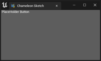
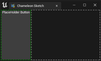
如果在第一个SBorder的中放入一个SButton,那么SBorder所需的尺寸就只有SButton所需要的尺寸
"Root":{
    "SHorizontalBox":
    {
        "Slots": [
            {
                "AutoWidth": true,
                "SBorder": { "BorderBackgroundColor": [0, 1, 0, 1], "BorderImage": { "Style": "FEditorStyle", "Brush": "DashedBorder"},
                    "Content": {
                        "SButton": { "Text": "PlaceHolder Button" }
                    }
                }
            },
            {
                "SBorder": { "BorderBackgroundColor": [1, 1, 1, 1], "BorderImage": { "Style": "FEditorStyle", "Brush": "DashedBorder"}}
            }
        ]
    }
}
左侧AutoWidth,其中放入一个SButton:
Rule 4. 当设置HAlign或 VAlign时,不能同时出现AutoWidth或AutoHeight
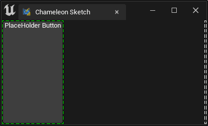
如下图,设置右侧白框为右对齐,此时不能有AutoWidth,控件会对齐到右侧,且只占据自身所需控件
"Root":
{
    "SHorizontalBox":
    {
        "Slots": [
            {
                "AutoWidth": true,
                "SBorder": { "BorderBackgroundColor": [0, 1, 0, 1], "BorderImage": { "Style": "FEditorStyle", "Brush": "DashedBorder"},
                    "Content": {
                        "SButton": { "Text": "PlaceHolder Button" }
                    }
                }
            },
            {
                "HAlign": "Right",
                "SBorder": { "BorderBackgroundColor": [1, 1, 1, 1], "BorderImage": { "Style": "FEditorStyle", "Brush": "DashedBorder"}}
            }
        ]
    }
}
右侧白框设置:右对齐
注意!
AutoWidth是SHorizontalBox Slots的属性,而AutoHeight是 SVerticalBox) Slots的属性。只能在它们各自的Slot中指定,两者不会同时出现- 注意Output窗口中的提示,当写错属性名,或者使用了不存在的属性时,会有警告字样(v1.0.10)
例如,SBox中的
"MinDesiredWidth"和"MinDesiredHeight"就需要控件的上层有SVerticalBox或者SHorizontalBox等提供布局功能的组件才能工作 ``
实际使用
实际使用时,通常会在SVerticalBox嵌套放入多个SHorizontalBox, "SScrollBox",各个子布局控件中又有其他的SVerticalBox,SHorizontalBox等
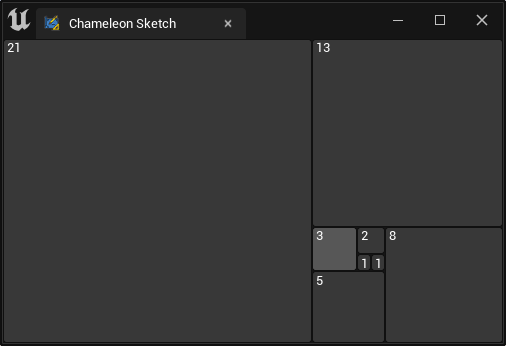
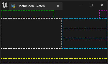
例如下面的界面中,就用SBorder模拟了一个简单的界面布局:
- 绿框可以是标题
- 紫框是选项按钮,一直靠右
- 下方黄色是状态栏等
注意
- 这里使用了若干个"SBorder"来模拟子空间占用的空间,实际使用中通常一个工具界面中只有最上层会有一个“Border”
- 这里用
"Padding": 16让"SBorder"控件额外向四边占用了16像素,模拟子控件占用的空间 - 实际关于
"Padding"是用来控制控件间的间隔,具体解释可见这里Padding, Margin 关于 ContentPadding
{
    "TabLabel": "Chameleon Sketch",
    "InitTabSize": [400, 240],
    "InitTabPosition": [120, -500],
    "InitPyCmd": "import ChameleonSketch; sketch = ChameleonSketch.ChameleonSketch.ChameleonSketch(%JsonPath)",
    "Root":{
        "SVerticalBox":
        {
            "Slots": [
                {
                    "AutoHeight": true,
                    "SHorizontalBox":
                    {
                        "Slots": [
                            {
                                "SBorder": {
                                    "BorderBackgroundColor": [0, 1, 0, 1], "BorderImage": { "Style": "FEditorStyle", "Brush": "DashedBorder"},
                                    "Padding": 16
                                }
                            },
                            {
                                "HAlign": "Right",
                                "SBorder": {
                                    "BorderBackgroundColor": [1, 0, 1, 1], "BorderImage": { "Style": "FEditorStyle", "Brush": "DashedBorder"},
                                    "Padding": 16
                                }
                            }
                        ]
                    }
                },
                {
                    "AutoHeight": true,
                    "SHorizontalBox":
                    {
                        "Slots": [
                            {
                                "AutoWidth": true,
                                "SBorder": {
                                    "BorderBackgroundColor": [1, 1, 1, 1], "BorderImage": { "Style": "FEditorStyle", "Brush": "DashedBorder"},
                                    "Padding": [120, 60]
                                }
                            },
                            {
                                "SVerticalBox":
                                {
                                    "Slots": [
                                        {
                                            "SBorder": { "BorderBackgroundColor": [0, 0.5, 1, 1], "BorderImage": { "Style": "FEditorStyle", "Brush": "DashedBorder"}}
                                        },
                                        {

                                            "SBorder": { "BorderBackgroundColor": [0, 0.5, 1, 1], "BorderImage": { "Style": "FEditorStyle", "Brush": "DashedBorder"}}
                                        },
                                        {
                                            "SBorder": { "BorderBackgroundColor": [0, 0.5, 1, 1], "BorderImage": { "Style": "FEditorStyle", "Brush": "DashedBorder"}}
                                        }
                                    ]
                                }
                            }
                        ]
                    }
                },
                {
                    "VAlign": "Bottom",
                    "SBorder": {
                        "BorderBackgroundColor": [1, 1, 0, 1], "BorderImage": { "Style": "FEditorStyle", "Brush": "DashedBorder"},
                        "Padding": 10
                    }
                }
            ]
        }
    }
}