在Slate中有三种常见的格子类控件它们分别是:
- SGridPanel
- SUniformGridPanel
- SUniformWrapPanel
SGridPanel
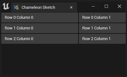
SGridPanel用于创建 m 列 n 行的的格子布局. 并且我命可以指定各列占用的宽度比例.
比如下面代码中的"FillColumn": [[0, 0.62], [1, 0.38]]将第0列的宽度和第1列的宽度设置为0.62 : 0.38
    "SGridPanel":
    {
        "FillColumn": [[0, 0.62], [1, 0.38]],
        "Slots":
        [
            {
                "Column_Row": [0, 0],
                "SButton": { "Text": "Row 0 Column 0", "ContentPadding": [0, 8]}
            },
            {
                "Column_Row": [1, 0],
                "SButton": { "Text": "Row 0 Column 1", "ContentPadding": [0, 8]}
            },
            {
                "Column_Row": [0, 1],
                "SButton": { "Text": "Row 1 Column 0", "ContentPadding": [0, 8]}
            },
            {
                "Column_Row": [1, 1],
                "SButton": { "Text": "Row 1 Column 1", "ContentPadding": [0, 8]}
            },
            {
                "Column_Row": [0, 2],
                "SButton": { "Text": "Row 2 Column 0", "ContentPadding": [0, 8]}
            },
            {
                "Column_Row": [1, 2],
                "SButton": { "Text": "Row 2 Column 1", "ContentPadding": [0, 8]}
            }
        ]
    }
SUniformGridPanel
用于创建 m 列 n 行的平分空间的格子布局,
    "SUniformGridPanel": {
        "MinDesiredSlotHeight": 150,
        "MinDesiredSlotWidth": 150,
        "SlotPadding": 5,
        "Slots": [
            {
                "Column_Row": [0, 0],
                "SButton": { "Text": "Placeholder A"}
            },
            {
                "Column_Row": [1, 0],
                "SButton": { "Text": "Placeholder B"}
            },
            {
                "Column_Row": [2, 0],
                "SButton": { "Text": "Placeholder C"}
            },
            {
                "Column_Row": [0, 1],
                "SButton": { "Text": "Placeholder D"}
            },
            {
                "Column_Row": [1, 1],
                "SButton": { "Text": "Placeholder E"}
            },
            {
                "Column_Row": [2, 1],
                "SButton": { "Text": "Placeholder F"}
            }
        ]
    }
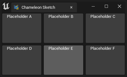
可以用"MinDesiredSlotWidth" 和"MinDesiredSlotHeight"指定单个网格的最小尺寸.
!!! 注意, "SUniformGridPanel" 并没有所谓的"MaxDesiredSlotWidth" 和"MaxDesiredSlotHeight". 如需控制其最大尺寸,可以在其上层添加SBox,并设置对应的"MaxDesiredWidth"或"WidthOverride"等
    "SUniformGridPanel": {
        "MinDesiredSlotWidth": 100,
        "MinDesiredSlotHeight": 100,
        ...
    }
应用
地图
Button Padding
在UE5中, Epic 给SButton的水平方向添加了各8个px的空白. 好处: - 按钮比例看上去更为合适
坏处: - 按钮在尺寸较小的时候,左右的空白会遮挡文字的显示
解决方法
在SButton
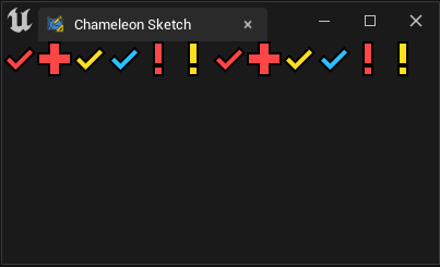
SUniformWrapPanel
与SUniformGridPanel 类似, "SUniformWrapPanel" 也可以创建格子布局,和它不同的是,"SUniformWrapPanel"会在自上而下的每一行中尽量放入子控件,如果放不下了,则放入下一行
    "SUniformWrapPanel": {
        "Slots":
        [
            {"SImage": { "DesiredSizeOverride": [32, 32], "Image":{ "Style": "FEditorStyle", "Brush": "Perforce.CheckedOut"}}}
            ,{"SImage": { "DesiredSizeOverride": [32, 32], "Image":{ "Style": "FEditorStyle", "Brush": "Perforce.OpenForAdd"}}}
            ,{"SImage": { "DesiredSizeOverride": [32, 32], "Image":{ "Style": "FEditorStyle", "Brush": "Perforce.CheckedOutByOtherUser"}}}
            ,{"SImage": { "DesiredSizeOverride": [32, 32], "Image":{ "Style": "FEditorStyle", "Brush": "Perforce.CheckedOutByOtherUserOtherBranch"}}}
            ,{"SImage": { "DesiredSizeOverride": [32, 32], "Image":{ "Style": "FEditorStyle", "Brush": "Perforce.ModifiedOtherBranch"}}}
            ,{"SImage": { "DesiredSizeOverride": [32, 32], "Image":{ "Style": "FEditorStyle", "Brush": "Perforce.NotAtHeadRevision"}}}
            ,{"SImage": { "DesiredSizeOverride": [32, 32], "Image":{ "Style": "FEditorStyle", "Brush": "Perforce.CheckedOut"}}}
            ,{"SImage": { "DesiredSizeOverride": [32, 32], "Image":{ "Style": "FEditorStyle", "Brush": "Perforce.OpenForAdd"}}}
            ,{"SImage": { "DesiredSizeOverride": [32, 32], "Image":{ "Style": "FEditorStyle", "Brush": "Perforce.CheckedOutByOtherUser"}}}
            ,{"SImage": { "DesiredSizeOverride": [32, 32], "Image":{ "Style": "FEditorStyle", "Brush": "Perforce.CheckedOutByOtherUserOtherBranch"}}}
            ,{"SImage": { "DesiredSizeOverride": [32, 32], "Image":{ "Style": "FEditorStyle", "Brush": "Perforce.ModifiedOtherBranch"}}}
            ,{"SImage": { "DesiredSizeOverride": [32, 32], "Image":{ "Style": "FEditorStyle", "Brush": "Perforce.NotAtHeadRevision"}}}
        ],
        "ToolTipText": "UniformWrapPanel will auto wrap the children."
    }
例如,这个例子中,SUniformWrapPanel 中就会尽量将 32 x 32的SImage放入一行.
!!! 注意, 在UE4中,SImage组件没有"DesiredSizeOverride"属性, 控制SImage的尺寸需要用SBox
{
    "SBox": { "MinDesiredHeight": 32, "MinDesiredWidth": 32,
    "Content": {
        "SImage": { "Image":{ "Style": "FEditorStyle", "Brush": "Tutorials.Navigation.NextButton"}}}
    }
}