在之前的介绍中,我们使用过很多次的"Style" 和"Brush"。比如下面的JSON代码的意思是:从"FEditorStyle"中找到名为"ToolPanel.DarkGroupBorder"的 Brush并将其赋给SBorder的"BorderImage"属性。
BorderImage
"SBorder": {
    "Padding": 3,
    "BorderImage": {
        "Style": "FEditorStyle",
        "Brush": "ToolPanel.DarkGroupBorder"
    },
    "Content":{
        ...
    }
}
上面的JSON中的内容和下面的C++代码是等价的:
SNew(SBorder)
.Padding(FMargin(3))
.BorderImage(FEditorStyle::GetBrush("ToolPanel.DarkGroupBorder"))
[
    //...
];
TIP
本文中所有的Sytle都可以在DefaultPythonSource repo@github的auto_gen中找到。
其他类似这样,通过Style获取编辑器预设值的属性还有:
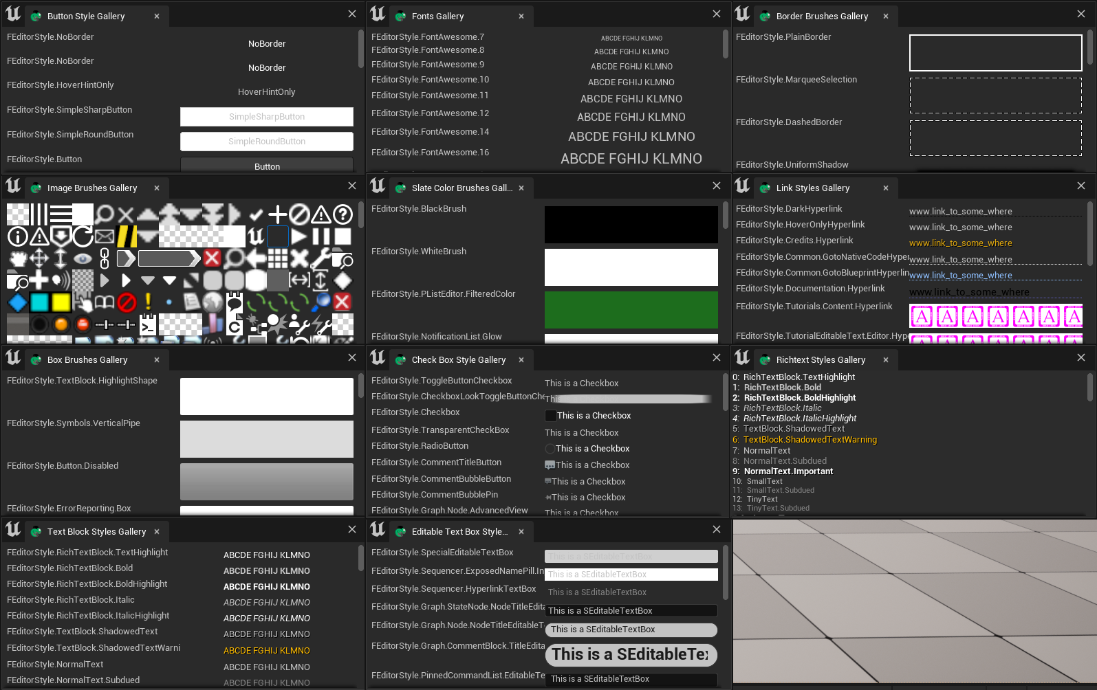
图片类
BorderImage of SBorder
"SBorder": {
    "BorderImage": {
        "Style": "FCoreStyle",
        "Brush": "ToolPanel.GroupBorder"
    },
    "Content": {
        ...
    }
}
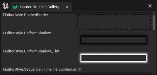
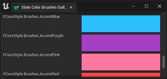
完整的界面截图在这里这里,这是一个700x2000+的图片。关于如何保存一个完整的界面截图,可以参考Take UI Snapshot 和Test case/截取Chameleon窗口
Border Brushes Gallery (707x2296)
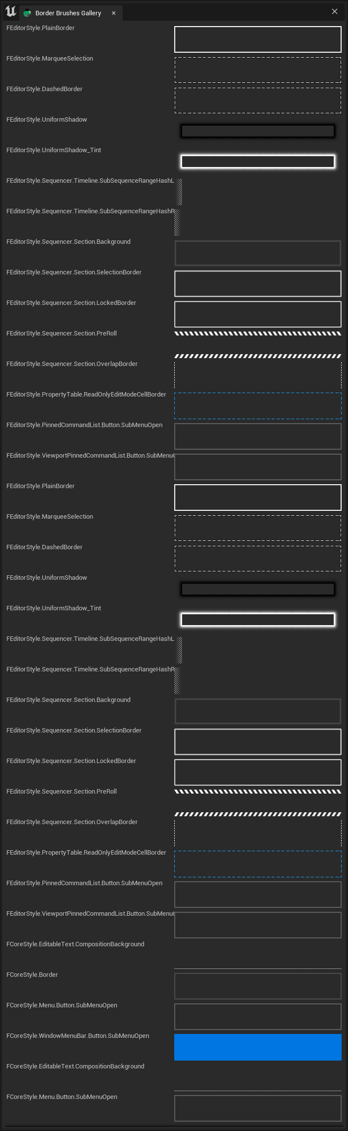
Image of SImage
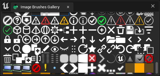
指定ImageBrush时,使用"Image"字段,并同样在其中指定"Style"和"Brush"字段。
"SImage": {
     "DesiredSizeOverride": [32, 32],
     "Image":{
        "Style": "FEditorStyle",
        "Brush": "Perforce.CheckedOut"
     }
}
TIPDesiredSizeOverride时UE5中才添加的属性,在UE4中如果要限制图片尺寸可以在SImage外侧套一个SBox。具体可以参考TAPython UE4版中自带的Shelf工具
Full Image of Image Brush Gallery (664x9248)
按钮样式类
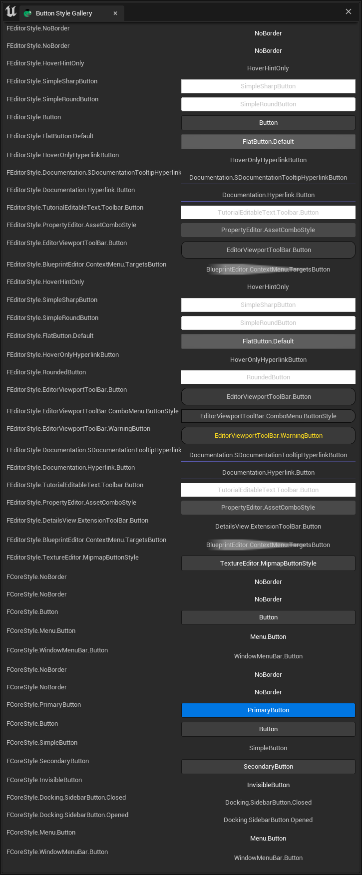
ButtonStyle of SButton
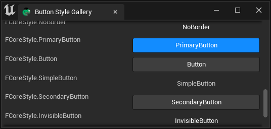
"ButtonStyle"字段用于指定SButton按钮样式,例如Shelf工具中的按钮样式:
Shelf.json
"SButton": {
    "ButtonStyle":
    {
        "Style": "FEditorStyle",
        "StyleName": "HoverHintOnly"
    },
    "ContentPadding": [16, 0]
}
Full Image of Button Style Gallery (725x1753)
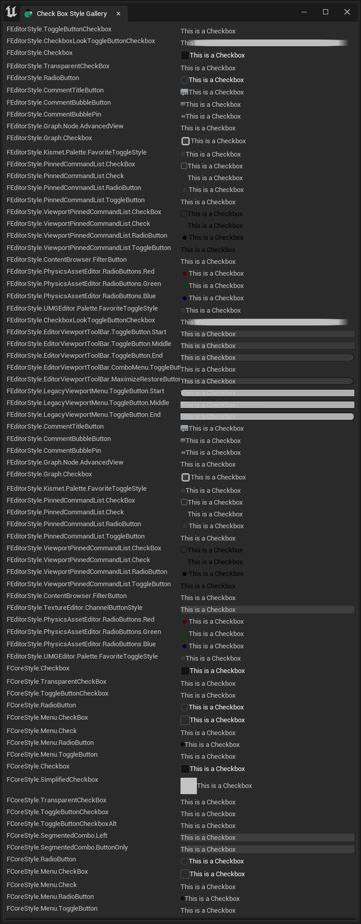
CheckBoxStyle of SCheckBox
"CheckBoxStyle"字段用于指定SCheckBox样式:
"SCheckBox":
{
    "Aka": "RiggingCheckbox",
    "Padding": [10, 2],
    "CheckBoxStyle": {
        "Style": "FCoreStyle",
        "StyleName": "ToggleButtonCheckboxAlt"
    },
    "HAlign": "Center",
    "Content": {
        "STextBlock": {
            "Text": "Rigging", "Font": {"Style": "FCoreStyle", "StyleName": "DefaultFont.Bold.11"} }
        },
    "IsChecked": true,
    "OnCheckStateChanged": "chameleon_control_rig.checkbox_click(%, id=0)"
}
Full Image of Check Box Style Gallery (704x1800)
文字样式类
Font of STextBlock
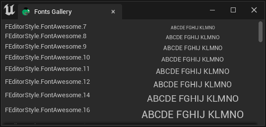
"TextStyle"字段用于指定STextBlock文字样式
"STextBlock": {
    "Text": "Some Text",
    "Justification": "Center",
    "TextStyle": {
        "Style": "FEditorStyle",
        "StyleName": "TextBlock.ShadowedTextWarning"
    }
}
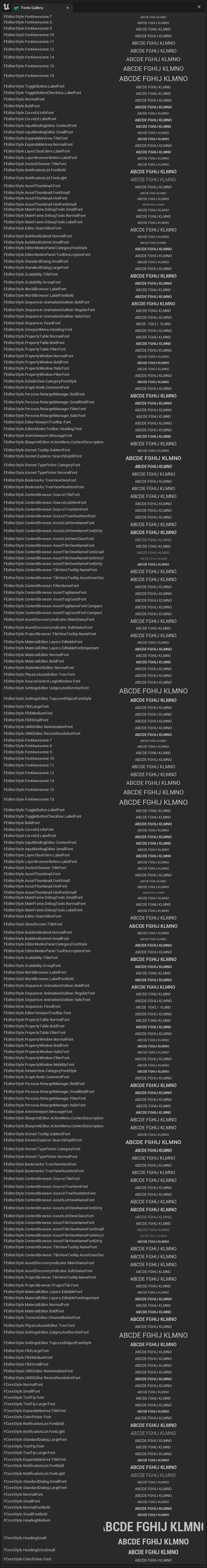
Full Image of Fonts Gallery (707x5337)
关于文字的更多相关信息可见:Texts
Style of SEditableTextBox
"SEditableTextBox": {
    "Style":{
        "Style": "FEditorStyle",
        "StyleName": "Graph.CommentBlock.TitleEditableText"
    },
    "Text": "This is a SEditableTextBox"
}
这里的"Syyle"字段没有任何前后缀,它指的是SEditableTextBox的样式。
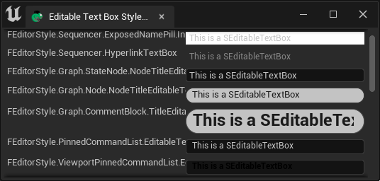
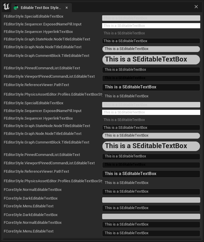
Full Image of Editable Text Box Gallery (707x838)
Style of STextBlock
"STextBlock": {
    "Text": "ABCDE FGHIJ KLMNO",
    "Justification": "Center",
    "TextStyle": {
        "Style": "FEditorStyle",
        "StyleName": "TextBlock.ShadowedTextWarning"
    }
}
TIP
SButton 中也有"TextStyle"字段,可以用来字段按钮中"Text"中指定的文字的样式。
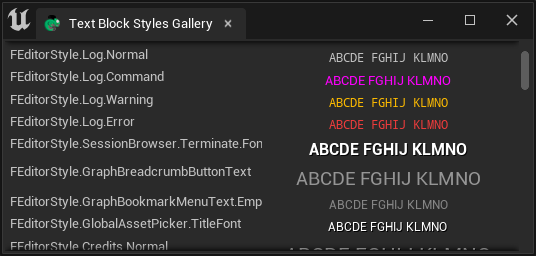
Full Image of Text Block Gallery (706x9802)
Style of SRichText
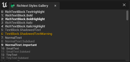
SRichText 中的Style并不直接由 "Style"deng字段指定,而是由"Text"字段中的标签指定。例如:
"SRichTextBlock":
{
    "Text": "<RichTextBlock.Bold>Bold</>  <RichTextBlock.TextHighlight>Highlight</>  <Credits.H2>Unreal</>"
}
Full Image of Richtext Style Gallery (706x5725)
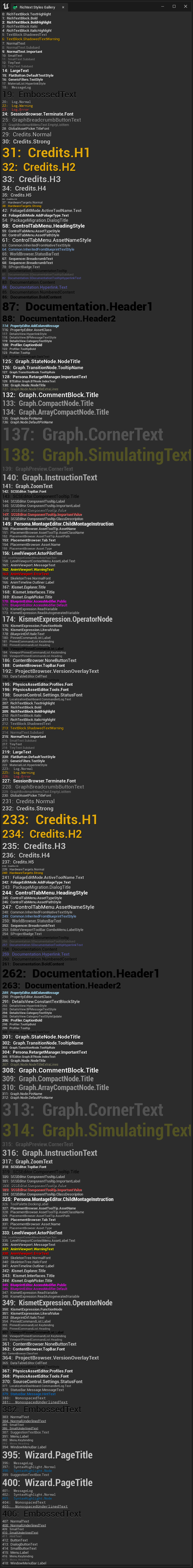
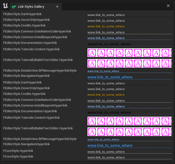
SHyperlink
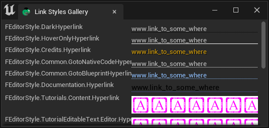
Full Image of Hyperlink Styles Gallery (706x662)
TextStyle
Style of Color Brush
"SHyperlink": {
    "Style":{
        "Style": "FEditorStyle",
        "StyleName": "Credits.Hyperlink"
    },
    "Text": "www.tacolor.xyz"
}
Full Image of Color Brushes Gallery (706x6388)
Style of Box Brush
下面用SBorder中的"BorderImage"字段来显示Box Brush的样式。由于SBorder中为指定了一个尺寸为[50px, 50px]的SSpacer作为占位控件,因此"BorderImage"即为整个控件的样式。
"SBorder":
{
    "BorderImage":{
        "Style": "FEditorStyle",
        "Brush": "PListEditor.HeaderRow.Background"
    },
    "Content":{
        "SSpacer":{"Size": [50, 50]}
    }
}
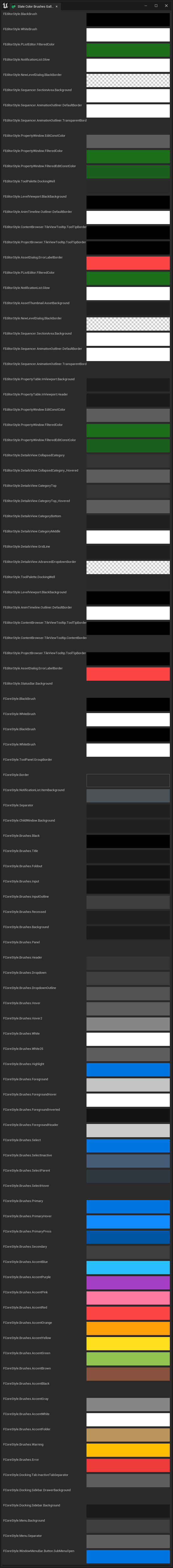
Full Image of Box Brush Gallery (699*27468)
Style Gallery
我们可以通过Chameleon Gallery工具中最下方的"Launch Editor Style Galleries"按钮来打开编辑器中的Style Gallery。
可以在DefaultPythonSource repo@github 获取所有到的.json文件,放入<Your_Project>\TA\TAPython\Python\ChameleonGallery\auto_gen\ 后,即可查看
常用的Style
TAPython中支持的Style有以下三种:
- FEditorStyle
- FCoreStyle
- FAppStyle
TIP
FAppStyle只在UE5中可用
如何找到Style
各个版本的UE引擎中,可用的Style明会有少许的区别,但是大部分的Style都是一致的。我们可以通过直接在Unreal Engine的源码中搜索来找到我们需要的Style。例如:
\Engine\Source\Editor\EditorStyle\Private\SlateEditorStyle.cpp\Engine\Source\Editor\EditorStyle\Private\StarshipStyle.cpp
在这两个巨大的c++文件中,我们可以看到注册的各种编辑器Style的名称和类型
相关参考
FEditorStyle in ue5.1