在Widget控件中有若干个和颜色相关的属性,例如:ForegroundColor, ColorAndOpacity, BorderBackgroundColor,ButtonColorAndOpacity等等。其中有一部分比较容易混淆,下面我们来举例看看这些属性的区别。
SBorder
ForegroundColor
The foreground color of text and some glyphs that appear as the border's content.
前景色是控件中文本的颜色
ColorAndOpacity
/* ColorAndOpacity is the color and opacity of content in the border /
ColorAndOpacity 是覆盖(乘法)在控件中上的整体的颜色。会同时影响上面的说的文本的颜色
ColorAndOpacity 是一个使用最多的颜色属性,很多其他的控件中也都有这个属性。它会影响自身子控件的颜色,因此,如果在想要修改的控件中没有颜色属性,也可以通过其父控件中的ColorAndOpacity来设置。
TIP
颜色叠加采用Multiple的方式计算,且在数值上可以大于1。
BorderBackgroundColor
/* BorderBackgroundColor refers to the actual color and opacity of the supplied border image./
BorderBackgroundColor 是背景色,这里对于SBorder来说就是实际边框的颜色
    "Root":{
        "SBorder": { "BorderImage":
            {
                "Style": "FEditorStyle", "Brush": "DashedBorder"
            },
            "ForegroundColor": [1, 0, 1, 1],
            "ColorAndOpacity": [1, 0.5, 0, 1],
            "BorderBackgroundColor": [0, 1, 0, 1],
            "Content": {
                "SHorizontalBox":
                {
                    "Slots": [
                        {
                            "STextBlock":
                            {
                                "Text": "Text Content"
                            }
                        },
                        {
                            "SButton": { "Text": "Placeholder B"}
                        }
                    ]
                }
            }
        }
    }
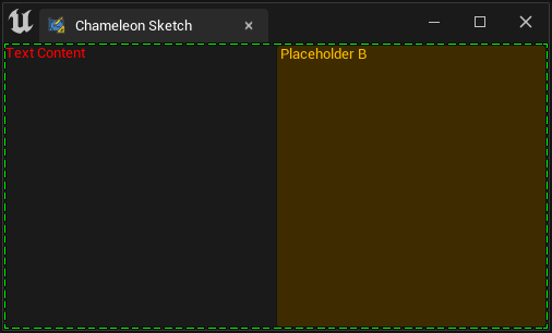
例如,这个例子中:
"ForegroundColor": [1, 0, 1, 1]: 紫色"ColorAndOpacity": [1, 0.5, 0, 1]: 橙色"BorderBackgroundColor": [0, 1, 0, 1]: 绿色
-
文本"Text Content"的颜色为红(
ForegroundColor:紫色 [1, 0, 1, 1]* ColorAndOpacity [1, 0.5, 0, 1] = 红色 [1, 0, 0, 1]) -
按钮的背景为橙色,来自"ColorAndOpacity", 实际上还乘以了按钮自身图片的颜色
-
按钮文字的颜色为橙色: 来自"ColorAndOpacity"。控件中非直接文字控件的颜色,不受SBorder的“ForegroundColor”影响
-
边框点画线的颜色为"BorderBackgroundColor"的颜色
SButton
SButton也有多个颜色属性属性:ColorAndOpacity和ButtonColorAndOpacity,同时它自身也支持Style,并且可以包含其他子控件,相对来说变化会比较多,下面我们来看看它们的区别。
关于SButton其他的内容可以参考这篇:Buttons
ButtonColorAndOpacity
ButtonColorAndOpacity将影响按钮本体的颜色,其与ButtonStyle中按钮样式是Multiple的关系
ColorAndOpacity
ColorAndOpacity会同时影响按钮上的文字,和Content中的其他控件,例如SImage
ForegroundColor
ForegroundColor只会影响按钮前景的内容(文字)不会的Content中的子控件等产生影响
具体看下例子,做个直观的了解:
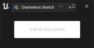
先从一个白色的按钮开始,下面的SButton中选用了"FEditorStyle.SimpleRoundButton",它是一个白色的圆角按钮,文字为灰色
"Root":
{
    "SVerticalBox":
    {
        "Slots": [{
                "VAlign": "Center",
                "SHorizontalBox":{
                    "Slots": [
                        {
                            "HAlign": "Center",
                            "SButton":
                            {
                                "Text": "A White Style Button",
                                "ContentPadding": [50, 20],
                                "ButtonStyle":{
                                    "Style": "FEditorStyle",
                                    "StyleName": "SimpleRoundButton"
                                }
                            }
                        }
                    ]
                }
            }
        ]
    }
}
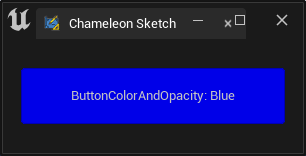
设置"ButtonColorAndOpacity"后,蓝色[0, 0, 1, 1] 被叠加(Multiple)到了按钮上,文字部分未受影响。
"SButton":
{
    "Text": "ButtonColorAndOpacity: Blue",
    "ButtonColorAndOpacity": [0, 0, 1, 1],
    "ContentPadding": [50, 20],
    "ButtonStyle":{ "Style": "FEditorStyle", "StyleName": "SimpleRoundButton"}
}
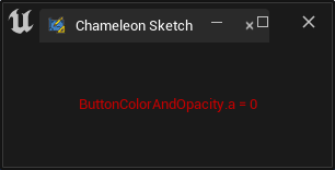
如果我们将颜色的alpha值设置为0,按钮自身变为纯透明只留下了文字。
"SButton":
{
    "Text": "ButtonColorAndOpacity.a = 0",
    "ButtonColorAndOpacity": [0, 0, 1, 0],
    "ContentPadding": [50, 20],
    "ButtonStyle":{ "Style": "FEditorStyle", "StyleName": "SimpleRoundButton"}
}
同时设置ColorAndOpacity 和ForegroundColor, 如下面例子中,两者的值分别为青色[0, 1, 1, 1]和红色[1, 0, 0, 1],相乘之后,字体颜色为黑色。
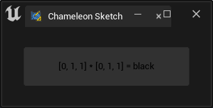
"SButton":
{
    "Text": "[0, 1, 1] * [0, 1, 1] = black",
    "ButtonColorAndOpacity": [1, 1, 1, 0.1],
    "ColorAndOpacity": [0, 1, 1, 1],
    "ForegroundColor": [1, 0, 0, 1],
    "ContentPadding": [50, 20],
    "ButtonStyle":{
        "Style": "FEditorStyle",
        "StyleName": "SimpleRoundButton"
    }
}
TIP
当SButton的Content中如果内容,则只显示Content中的内容,不显示Text中的文本
下面例子中,按钮颜色被"ButtonColorAndOpacity":[1, 1, 0.5, 1]设置为浅黄色。Python图标中的颜色与"ColorAndOpacity": [0, 1, 1, 1]相乘,进而失去了所有的红色。
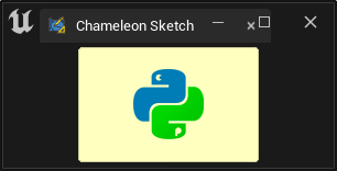
"SButton":
{
    "ButtonColorAndOpacity": [1, 1, 0.5, 1],
    "ButtonStyle":{
        "Style": "FEditorStyle",
        "StyleName": "SimpleRoundButton"
    },
    "ColorAndOpacity": [0, 1, 1, 1],
    "ContentPadding": [50, 20],
    "Content": {
        "SImage": {
            "Aka": "ImageInButton_A",
            "ImagePathInPlugin": "Resources/Icon128.png",
            "DesiredSizeOverride": [64, 64]
        }
    }
}
Text
文本中的颜色在Texts#Color中有较为详细的介绍, 推荐跳转查看。
Set Color with python
在Chameleon Data中,TAPython提供了以下三个用于设置颜色的函数:
set_color_and_opacity
支持的控件:
- SScrollBox
- SCheckBox
- SSpinBox
- SColorPicker
- SDropTarget"
- SBreadcrumbTrail
- SThrobber
- SBorder
- SHeaderRow
- SSeparator
- SButton
- SHyperlink
- SMultiLineEditableTextBox
- SEditableTextBox
- SSearchBox
- STreeView
- SListView
- SListView
- SScrollBox
- SImage
- STextBlock
- SEditableText
- SProgressBar
set_button_color_and_opacity
就如这个函数的名称,它支持的控件只有:
- SButton
set_color
这个函数很容易被误用,实际它的作用是为SColorBlock控件设置颜色,而不是为其他控件设置颜色。
支持的控件
-
SColorBlock
-
ForegroundColor The foreground color of text and some glyphs that appear as the border's content.
-
ColorAndOpacity /* ColorAndOpacity is the color and opacity of content in the border /
-
BorderBackgroundColor /* BorderBackgroundColor refers to the actual color and opacity of the supplied border image./